Friday, March 27, 2020

[Finished] Life Is Strange: Before the Storm: Farewel (spoiler review)

Game:  Life Is Strange: Before the Storm Bonus Episode: Farewell
Release date: 2018
Platform: PC
Date started: May 2018
Date finished: May 2018

Spoiler Warning 

Farewell is a short bonus episode about two friends spending an afternoon together. There are no high stakes, no dangerous criminals or saving a town from a natural disaster. The tension comes from the fact that Max didn't tell her best friend Chloe that she's moving away to Seattle and it is their last day together. We can feel the anxiety building up within her as she keeps delaying the information in hope to find the right moment to have this conversation.

The original voice actors Hannah Telle and Ashly Burch return as Max and Chloe in a short episode with a simple premise. What could possibly go wrong?
 

The gameplay

When you set up linear confined spaces and strip the game of its mechanics such as time rewind or backtalk, you get a somewhat shallow experience. There isn't much to do. Most of the time you will be reading notebooks and viewing kids' drawings which isn't terribly interesting (but at least they feel authentic). I liked playing through choose your own adventure book that the girls made because it reminded me of similar stuff I used to do as a kid. You can talk to Chloe but the dialogue options are more limited than ever before and maybe it's for the best because the dialogue is quite painful to listen to. Hannah Telle and Ashly Burch gave a convincing enough performance as little girls but the writing will make you cringe even more than usual. If the kids in Stranger Things talked like that, nobody would watch the show.

I always thought young Max's model looked really weird. Even back in the season 1


A major part of the episode was built around the idea of child's play so I expected Deck Nine would find a way to translate that into gameplay, considering they made the brilliant D&D session and the school drama play segments in previous episodes. They did kinda try it with one puzzle involving a telescope, which is one of the more uniquely done puzzles in the LiS series. But most of the time instead of having fun and enjoying the story, you will catch yourself wondering why are you doing such busywork as shifting furniture in the attic.


Foreshadowing

Farewell is the shortest LiS episode by far. I feel like it would benefit greatly from another short chapter at the end where the girls would visit the lighthouse before heading home and finding Chloe's mother sobbing after hearing the tragic news. At the lighthouse they could've carved the message on the tree stomp that we saw in the original game. Not only does Farewell take place in 2008 but they also played pirates that day. It would've nicely tied everything together.

Carved tree stomp in Life is Strange 1

The ending does pack an emotional punch. It's something that we got used to in this series but didn't quite expect from an innocent bonus episode. It was clever how they made the girls play dress up and change clothes so we don't realize that Farewell is set on the day William died. In the first game we found out Max left Chloe shortly after the death of her father but I never imagined it happened right after his funeral. It may work very well for this episode but it seems a bit too (in)convenient. There's a theory among LiS fans that the message on the tape recorder was actually left by Max from the future when she jumped back in time through the photograph. Not sure if I would agree with it but it's nice there's some room left for speculation and I feel like it adds a bit more depth to the episode.


+ emotional ending
+ original voice actors return


- very short
- abysmal gameplay
- cringey dialogue


4.5/10        

Monday, January 27, 2020

System Shock remake demo impressions


The System Shock remake demo was released for 48 hours on Steam during The Game Awards 2019 and I had to try it. But before I give you my thoughts I want to give you a little history.


Troubled development


In 2016 Nightdive Studios launched a Kickstarter campaign for System Shock remake and released a short demo alongside it. The demo was made in Unity and used lightning to a great effect in order to create the atmosphere. It looked modern but faithful and the Kickstarter was a great success, gathering over $1.35M.

The development problems started when they switched to the Unreal engine, citing lack of fidelity, performance issues and bad cross-platform support on Unity. They had to start from scratch on the new engine but the team was taking more liberties in designing the game so it began looking more like a reboot than a remake. They even experimented with some mechanics that the original Looking Glass team wanted to implement but couldn't due to technical limitations of 1994. First screenshots revealed more realistic but also more generic look - gone were the charming colors of the Unity build, replaced by dark grey corridors that looked like every other sci-fi horror you've already played. Kickstarter backers weren't happy with the new direction and the game was scrapped once again. In March 2018 the director Stephen Kick announced the team is going back to their original vision, targeting 2020 release. The pre-alpha demo was released for a limited time during The Game Awards 2019 and was made permanently available for all Kickstarter backers shortly after.

System Shock 2 was always one of my favorite games but I haven't played the first one until 2013. After getting over horrible controls I ended up quite liking it. I wasn't pleased when I heard it's getting a remake but once I saw the gameplay footage, the unique visual style won me over.

Unreal vs. Unity


I didn't have a good enough PC to run the Unity demo when it came out and I forgot to return to it later. Now I had an opportunity to play both demos back to back, alongside the original game's hospital level, and I gotta say I prefer the Unity version. It looks better, runs better and plays better.
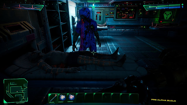
Unfortunately the Unreal demo feels like a downgrade in many ways.  The Unity demo is visually more appealing with it's vibrant colors and masterful lighting. The Unreal build is way too dark (Doom 3 levels of dark) and I often wished I had a flashlight. Some animations that were present in Unity (waking up, healing pod animation) are missing here. The demo is also horribly optimized and gradually drops FPS but that's not unexpected from a game in pre-alpha stage.


The art direction gives the game a distinct retro feel by combining high quality models with low res pixelated textures. 


The melee combat feels terrible and there's no depth to it. Swinging a pipe in the previous demo had a weight and momentum to it and you could feel the impact upon hitting the enemy. Not anymore. Using the energy weapon felt much more satisfying as well.


Medical mutant cyborg is a new addition to the game. He's just doing his job, not threatening you.


The new demo is much larger and features the full hospital level. The level design is faithful to the original and running around the Citadel station and mapping it out felt like a proper System Shock experience. I love the new user interface. It looks like a cleaner version of System Shock 1 UI combined with Deus Ex style inventory and quick access. Some inventory functions are still missing, like the ability to load a pistol by dragging a magazine onto it. And why does an empty soda can stay in your inventory after you drink it? That's just annoying. Certain items like berserk, staminup and medipatch look identical with a slightly different color shade. The colors need to be more distinct. Another confusing thing is there's no visual difference between items you can pick up and other random stuff lying around on shelves.


The UI is a huge improvement over the original game but still looks faithful

Looks like you should be able to pick up these items but you can't- they're all decorations.


Even tho the new demo feels like a step back in some ways, I believe it's going to be a decent game once they polish it. Despite of bad performance and crashes I enjoyed playing through it. I'm just worried that modern gamers won't have the patience to explore the maze-like level design of System Shock.
 

Screenshot comparisons


Unity Unreal


Update

One of the developers addressed the criticism and comparisons with the Unity demo on reddit. Here's what he said:

"The Unity demo we created was much smaller in scope so we had time to polish many of the secondary features for weapons and animations as well as lighting and optimization. Many of those are missing from the Unreal demo as we've focused on completing all the levels, basic mechanics and puzzles first. We were given the opportunity to participate in the VGA/Steam promotion so we used a number of work in progress elements to make it playable. Thanks for taking the time to put this together and share your feedback, the final version will include many of the things you've mentioned missing from the Unity demo."

I'm not quite sure I buy that because I would count things like melee combat into basic mechanics. I know the dev team changed and I suspect that the first demo was simply made by more talented guys. Hope to be proven wrong.

During a recent developer stream they showed an updated version of the game and it seems like they fixed 2 major issues with the demo: the performance and lightning. Memory leaks have been patched up and lightning was vastly improved. All the corridors are now well lit.

You can watch the VOD bellow:


Saturday, January 18, 2020

Plans for 2020


In 2019 I only finished one game- The Awesome Adventures of Captain Spirit, which technically doesn't even count since it's just a companion piece to Life Is Strange 2.
One of my new year's resolutions was to beat more games and make up for it in 2020. I'm going to ramp it up and try to beat 2 games each month: aiming to finish at least 24 games in 2020.

January should be easy since I just need to finish games I already started. I'm quite far into Death Stranding as well as a couple of PSVR games.

I'm also planing to be more active here and revitalize this blog. I'll start by writing quick reviews for games I've beaten in 2018: Life is Strange: Before the Storm and Beyond: Two Souls. Then I'm going to report on the progress as I play new games.

There's one game that I'm more devoted to than others and that's Starcraft 2.I'm trying my best to improve but the highest rank I was able to reach was Master 3 and I couldn't even retain it. This year I won't be satisfied unless I reach the highest possible rank- Grandmaster. I'm ready to do whatever it takes to get there.

Wednesday, November 27, 2019

Hellbound Demo - yet another "90s FPS"


Hellbound is an upcoming FPS inspired by the classics like Doom, Quake, Blood and others. There's been quite a lot of games inspired by the 90s shooters lately: Dusk, Ion Fury, Wrath: Aeon of Ruin to name a few. They all have one thing in common: retro aesthetics. Hellbound on the other hand embraces modern graphics. Survival mode where you try to stay alive while enemies attack you in waves was out for some time but the campaign demo was just released. I decided to give it a try.

Beat the demo and I liked it. Then I beat it a couple of times more cause it's short and fun. There's no depth to it nor it has any advanced movement. During fights you just gotta keep running around so make sure to check "always run" in the options. It resembles Serious Sam combat in that way but there aren't as many enemies and the areas aren't as open. At least not at this point because Survival mode showed they can spawn tons of them. The weapon feel could be improved but I like the shotgun - it packs some serious power. The lack of a bossfight at the end of the demo was pretty disappointing. The game runs well enough on medium settings with some occasional stuttering on my laptop with GTX 1050TI but I'm sure they'll optimize it more before the release. I liked it enough to want to buy it when it comes out.


I found the secret eventually

Friday, November 15, 2019

Death Stranding: First Impressions


I'm about 6 hours into the game. It looks amazing on my 55" 4K screen, definitely the best looking PS4 game I've played. The cut scenes are well directed and I never felt like skipping them. Maybe because they're more interesting than the gameplay which mostly consists of walking around. Hiking through natural environments should be relaxing but when you carry tons of cargo and you need to shift the weight constantly, it becomes annoying and stressful instead. The balance mechanic is certainly unique and it adds some extra tension during chase sequences. The soundtrack is nice and fits the mood. I'm only at the beginning and my bullshit meter is already off the charts but I need to understand the story better before I start calling things out.

Basically I like the presentation and dislike the gameplay (and something tells me it won't get much better) so whether I'd like the game or not is gonna come down to the story, which isn't looking great so far.

DRINK THE MONSTER ENERGY!
Ugh the Monster Energy...that's the most blatant product placement I've ever seen, even integrated in the gameplay itself. Death Stranding was produced by Sony and Kojima thinks of himself as an artist so I don't understand why would he compromise his game like that. There's also an advert for Norman Reedus's AMC show Ride but that one didn't bother me because it feels more like an Easter egg rather than an ad.


Saturday, November 9, 2019

Next to play: Death Stranding


Game: Death Stranding
Release date: 2019
Platform: PS4

Conditions: Finish the story on normal difficulty

Just picked up Death Stranding. Avoided all reviews, gameplay videos and discussions. I wanna go into it as blind as possible and experience this "new genre" for myself. I'm ready for a huge letdown :D


Tuesday, February 12, 2019

[FINISHED] Life Is Strange: Before the Storm Episode 3: Hell Is Empty


Game:  Life Is Strange: Before the Storm Episode 3: Hell Is Empty
Release date: 2017
Platform: PC
Date started: May 2018
Date finished: May 15 2018

Spoiler Warning!

The revelation at the end of the last episode shook Rachel's world and completely shifted the direction of the story. The plan to leave Arcadia Bay is temporarily shelved until they find Rachel's biological mother. The search crosses their path with a criminal Damon Merrick who doesn't like people asking questions about his clients and things get far more complicated when he finds out Rachel is a daughter of a district attorney...

Episode 3 wants you to answer one question: What is better- a convenient lie or the ugly truth? It is an omnipresent theme intertwined within the main story, random conversations and even the puzzles of the game. For the first time in a Life is Strange game I had to really think before making a decision because the choices presented didn't feel so black and white anymore. Even the dialogue felt more mature and less cringey than usual. Unfortunately, just like the finale of the season 1, the conclusion of Before the Storm appears to be rushed and unfinished. Near the end of the game Chloe misses some important story moments, and therefore we as players don't get to experience them. We only get told what happened. I can't imagine it was a narrative design choice, it felt like a compromise to solve a budget issue or to meet the release date.

The episode starts with surreal imagery as the girls are literally looking into the past through a telescope. It somewhat reminded me of the nightmare sequence from the season one finale. Dreams play an important role in Before the Storm and this episode goes further as Chloe is having imaginary conversations with her dead father. All the dreamy imagery threw me off a little bit and at one point when Chloe was having an important real conversation near the end, I was questioning whether it was really happening or was it just another dream. In truth it was just sloppy storytelling. But how is the gameplay?

We're fixing the truck...AGAIN?!


Come on! Despite of it being an annoying tedious busywork I gave it a pass last time because at least they let us personalize it in some way. No more! Here it started as a cut scene and it should've ended as a cut scene but instead they turned it into a pointless and insultingly simple puzzle. Warren Spector once said a video game should be interactive whenever possible but I'm pretty sure he didn't mean this.

In the past episodes Deck Nine gave us some cool memorable moments by combining gameplay with dialogue. The tabletop mini game in the episode 1 and the school play in the episode 2 were some of my favorite moments of the game. I was looking forward to what they can come up with for the finale, only to find there's no new creative interaction like that. We only got an option to finish the tabletop session, which was still nice.

I also expected more scenes of Chloe and Rachel together and their relationship explored further so I thought it was an odd choice to have them separated during the entire second half of the game. The antagonist Damon Merrick felt like a real threat despite of me ultimately knowing how the things are gonna turn out. Chloe's stepfather David got one moving scene that gave him much needed humanity and I liked how they found a way to include her real dad into the story as well. Flawed fathers was an underlying theme of the story after all. On the other hand I didn't like the stalker Elliot subplot. Seems like they wanted a character that acts as a dark mirror to Warren from season one but his inclusion felt forced and made the story formulaic.

The way they handled final conflict was very odd. The fact that the main character wasn't the one who saved the day was somewhat refreshing but at the same time it ended up feeling quite uneventful because she passed out and missed what happened. The final decision wasn't easy to make during my playthrough but looking back at it now, it seems pretty obvious which choice was the right one. I liked the uplifting montage at the end and I wish they would leave it at that. Ending on a positive note and letting us remember what's coming would make for a perfect bittersweet ending. Unfortunately they ruined it with a post-credit scene that pushes it right in our face.


My Choices (SPOILERS!)


Only 4% of players got to experience the best part of the game? :P
+ less cringey             dialogue
+ harder choices


- rushed  
- unsatisfactory conflict resolution
-post-credits scene


6/10