The System Shock remake demo was released for 48 hours on Steam during The Game Awards 2019 and I had to try it. But before I give you my thoughts I want to give you a little history.
Troubled development
In 2016 Nightdive Studios launched a Kickstarter campaign for System Shock remake and released a short demo alongside it. The demo was made in Unity and used lightning to a great effect in order to create the atmosphere. It looked modern but faithful and the Kickstarter was a great success, gathering over $1.35M.
The development problems started when they switched to the Unreal engine, citing lack of fidelity, performance issues and bad cross-platform support on Unity. They had to start from scratch on the new engine but the team was taking more liberties in designing the game so it began looking more like a reboot than a remake. They even experimented with some mechanics that the original Looking Glass team wanted to implement but couldn't due to technical limitations of 1994. First screenshots revealed more realistic but also more generic look - gone were the charming colors of the Unity build, replaced by dark grey corridors that looked like every other sci-fi horror you've already played. Kickstarter backers weren't happy with the new direction and the game was scrapped once again. In March 2018 the director Stephen Kick announced the team is going back to their original vision, targeting 2020 release. The pre-alpha demo was released for a limited time during The Game Awards 2019 and was made permanently available for all Kickstarter backers shortly after.
System Shock 2 was always one of my favorite games but I haven't played the first one until 2013. After getting over horrible controls I ended up quite liking it. I wasn't pleased when I heard it's getting a remake but once I saw the gameplay footage, the unique visual style won me over.
Unreal vs. Unity
I didn't have a good enough PC to run the Unity demo when it came out and I forgot to return to it later. Now I had an opportunity to play both demos back to back, alongside the original game's hospital level, and I gotta say I prefer the Unity version. It looks better, runs better and plays better.
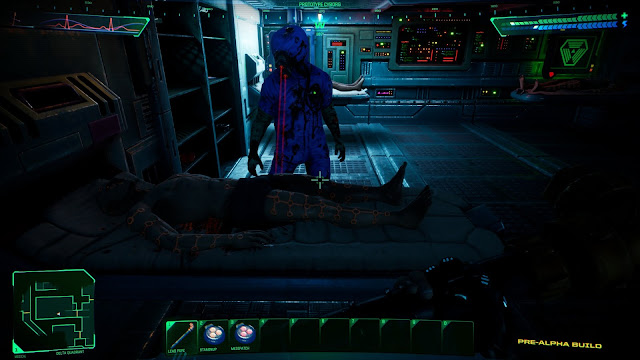
Unfortunately the Unreal demo feels like a downgrade in many ways. The Unity demo is visually more appealing with it's vibrant colors and masterful lighting. The Unreal build is way too dark (Doom 3 levels of dark) and I often wished I had a flashlight. Some animations that were present in Unity (waking up, healing pod animation) are missing here. The demo is also horribly optimized and gradually drops FPS but that's not unexpected from a game in pre-alpha stage.
The art direction gives the game a distinct retro feel by combining high quality models with low res pixelated textures.
Medical mutant cyborg is a new addition to the game. He's just doing his job, not threatening you.
The new demo is much larger and features the full hospital level. The level design is faithful to the original and running around the Citadel station and mapping it out felt like a proper System Shock experience. I love the new user interface. It looks like a cleaner version of System Shock 1 UI combined with Deus Ex style inventory and quick access. Some inventory functions are still missing, like the ability to load a pistol by dragging a magazine onto it. And why does an empty soda can stay in your inventory after you drink it? That's just annoying. Certain items like berserk, staminup and medipatch look identical with a slightly different color shade. The colors need to be more distinct. Another confusing thing is there's no visual difference between items you can pick up and other random stuff lying around on shelves.
The UI is a huge improvement over the original game but still looks faithful
Looks like you should be able to pick up these items but you can't- they're all decorations.
Even tho the new demo feels like a step back in some ways, I believe it's going to be a decent game once they polish it. Despite of bad performance and crashes I enjoyed playing through it. I'm just worried that modern gamers won't have the patience to explore the maze-like level design of System Shock.
Screenshot comparisons
| Unity | Unreal |
|---|---|
|
|
|
|
|
|
|
|
|
|
|
|
|
|
|
|
|
|
|
|
Update
One of the developers addressed the criticism and comparisons with the Unity demo on reddit. Here's what he said:"The Unity demo we created was much smaller in scope so we had time to polish many of the secondary features for weapons and animations as well as lighting and optimization. Many of those are missing from the Unreal demo as we've focused on completing all the levels, basic mechanics and puzzles first. We were given the opportunity to participate in the VGA/Steam promotion so we used a number of work in progress elements to make it playable. Thanks for taking the time to put this together and share your feedback, the final version will include many of the things you've mentioned missing from the Unity demo."
I'm not quite sure I buy that because I would count things like melee combat into basic mechanics. I know the dev team changed and I suspect that the first demo was simply made by more talented guys. Hope to be proven wrong.
During a recent developer stream they showed an updated version of the game and it seems like they fixed 2 major issues with the demo: the performance and lightning. Memory leaks have been patched up and lightning was vastly improved. All the corridors are now well lit.
You can watch the VOD bellow:


